Redesigning Navigation
How We Cut the Clicks Between You and Your Data
When you manage ESG data across multiple portfolios, every unnecessary click adds up. Over the past few months, we completely rebuilt how users navigate Scaler. The goal was simple: get you to your data faster and keep you in context while you work.
Here is what we changed and why.
The Problem We Set Out to Solve
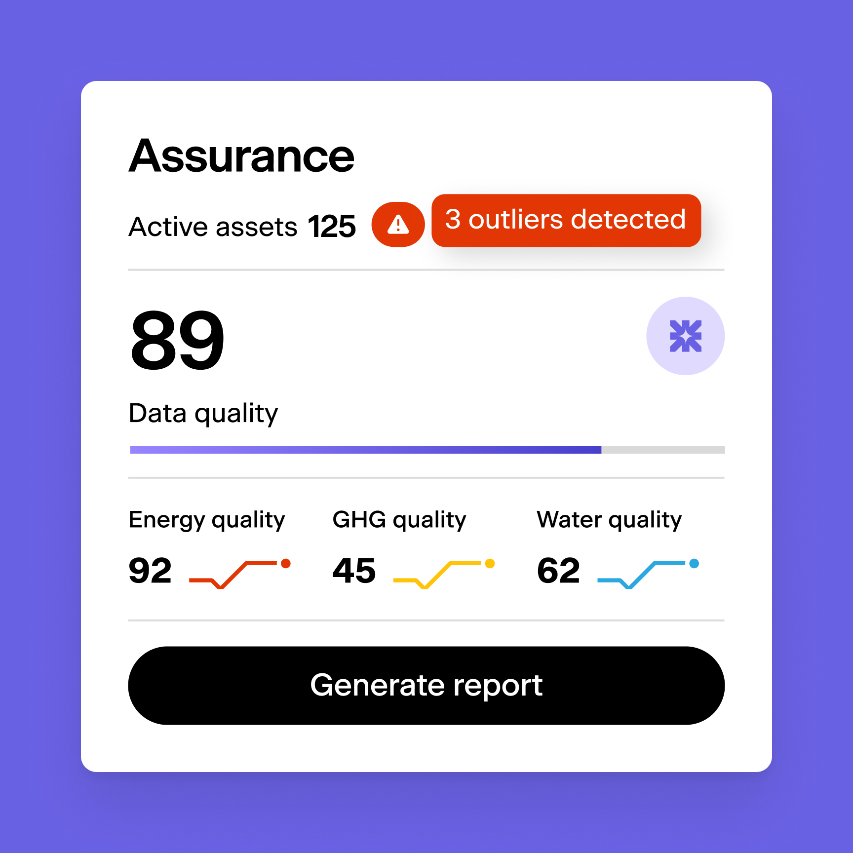
Scaler has grown significantly in the past year. We added Portfolio Alerts, a redesigned Asset List, Data Request tools, Custom Fields, Building Units, Calculated Meters, Asset Grouping, and upgraded Meter Lists. Reports are moving into the main navigation. Each feature added value, but they also added complexity.
Our old navigation was not built for this. The portfolio-level menu became crowded. Users told us it felt overwhelming. Important pages like Asset List were hard to find. And with more tools available at portfolio level versus asset level, users struggled to understand where to look for what.
We heard the same feedback repeatedly: "I spend more time navigating than actually fixing data."
What We Built
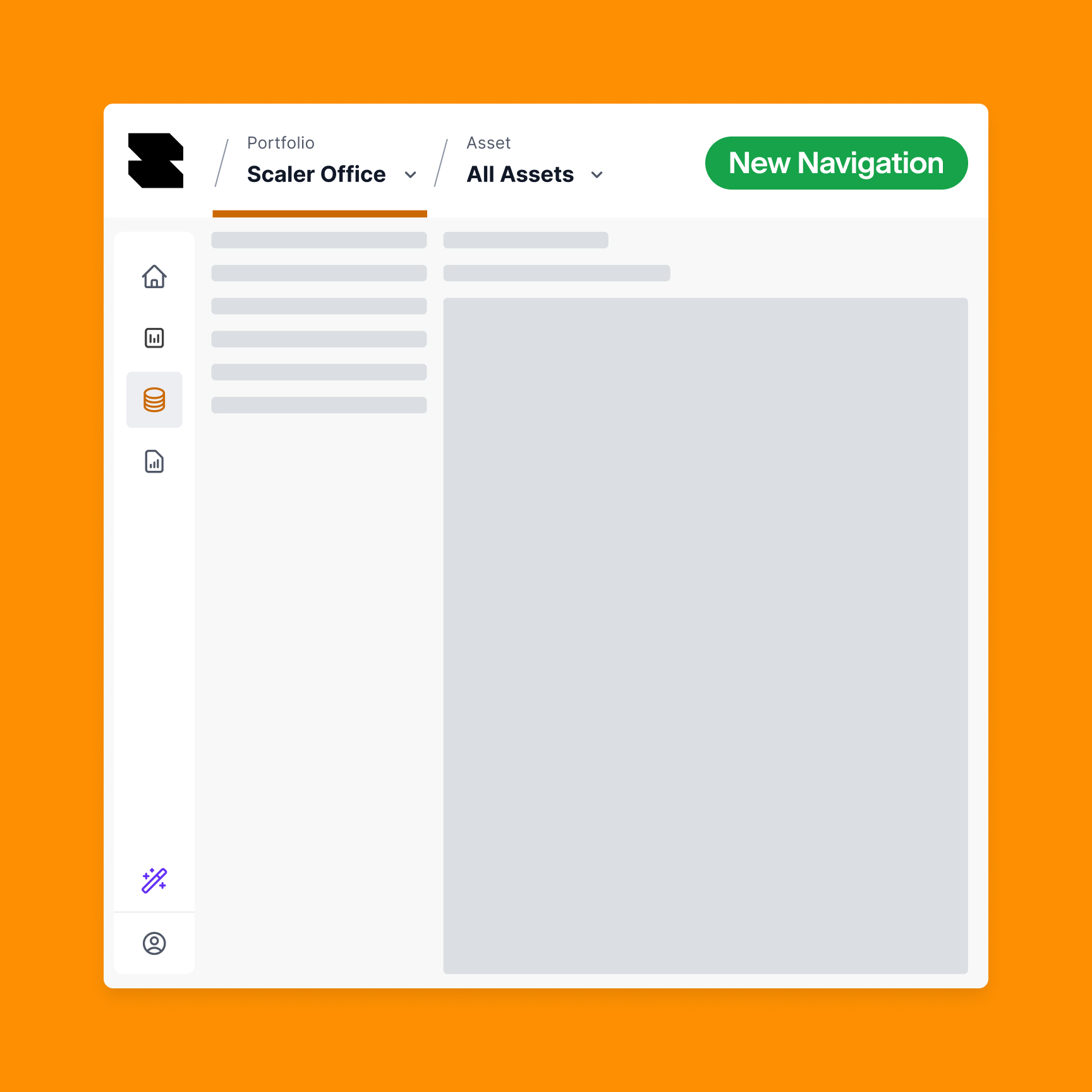
The new navigation consolidates company, portfolio, and asset selection into a single top bar. You always see where you are in the hierarchy. More importantly, you can jump directly to any level without backtracking.
A few specific changes that make a real difference:
1. Context-Aware Navigation
Previously, if you were viewing an asset and clicked back to the portfolio level, you landed on the portfolio overview page. Now you land on the asset list, because if you are working at asset level and go back up, you are most likely looking for another asset.
The same pattern applies everywhere: switch portfolios while viewing a meter list, and you stay on the meter list for the new portfolio. No more re-navigating where you were.
2. Cross-Portfolio Search
We split the company and portfolio dropdowns, which improved performance since we only load portfolios and assets for your selected company. But the bigger win was enabling search across all portfolios. Need to find a specific asset? Type the name and jump directly there. This was not possible before.
3. Clearer Visual Hierarchy
Early user testing revealed confusion about what was clickable versus what opened a dropdown. Users clicked the portfolio name expecting navigation but got a page reload instead. We redesigned the UI to make interactive elements obvious, added "View all" links in dropdowns, and ensured active states are always visible.
4. Reclaiming Screen Space
Removing the old breadcrumb system gave us back 150 pixels of vertical space. On data-heavy screens like the Asset List or Meter List, that extra room matters.
5. Streamlined Information Architecture
With more features living at portfolio level, we reorganized the sidebar to reduce clutter. Physical climate charts and table views merged into a single page. Data outliers moved into the Asset List as a tab. Upload logs consolidated the same way. Fewer menu items, same functionality.
6. Onboarding for Existing Users
Changing navigation risks confusing users who built muscle memory around the old system. We added an onboarding modal with short videos explaining the new structure and where to find key pages like Asset List. First-time users see this automatically; others can access it anytime.
What We Learned From Testing
We ran quick user tests with colleagues from Account Operations before wider release. Common feedback:
- It was not always clear which level (Company / Portfolio / Asset) they were on
- Clicking a portfolio name while already on its overview felt broken
- The suggestion to always display all three levels, even showing "All portfolios" or "All assets" when nothing is selected
We iterated based on this. The navigation now always shows Company / Portfolio / Asset in the header, making your current location unambiguous.
One debate we had internally: should Collection mode have a dark theme to distinguish it from Analytics? Previously only the header went dark, but with the new sidebar layout, this would create a much bigger visual shift. We decided against it for now, but we are exploring better ways to help users understand which mode they are in.
The Technical Approach
This was not a small change. The new navigation touches almost every page in the application. We could not put it behind a feature flag in the traditional sense because the structural changes were too deep.
Instead, we deployed incrementally to staging, tested extensively, and maintained a public task list so the team could track progress and report issues. When bugs appeared, we prioritized them immediately. The deployment happened in December, and we spent the following weeks refining based on real usage.
We also introduced lazy-loading for routes during this period. This keeps the interface responsive as you navigate, but it created a temporary issue: if a new version deployed while you were actively browsing, clicking links would fail because the old JavaScript chunks no longer existed. We solved this by detecting version mismatches and prompting users to refresh.
What Comes Next
Navigation is never finished. We are already working on:
- Favorites in the sidebar so you can pin frequently accessed portfolios or assets
- Better discoverability for features like Data Request and Bulk Import
- Continued refinement as we add more portfolio-level tools like Reports
The principle stays the same: your time is too valuable to spend clicking through menus. Every interaction should move you closer to your goal, not sideways through our interface.
If you have feedback on the new navigation, we want to hear it. The best UX improvements come from watching how real users work.