Why User Experience Defines the Success of a Data Platform
Scaler’s user-first approach transforms sustainability data into strategic value.
In the world of sustainability and real estate data, that truth defines whether a data platform succeeds or fails. Even the most advanced analytics engine or AI model is meaningless if teams struggle to navigate the interface or interpret what the data is telling them.
At Scaler, we’ve seen this first-hand. Across our clients, adoption doesn’t stop at the sustainability team. It extends to asset managers, finance teams, property managers, and even operations staff. The reason is simple: we’ve built a user experience that makes complex sustainability data simple, intuitive, and actionable.
Why UX matters more than ever
Real estate professionals are dealing with more data and more reporting frameworks than ever before. But when platforms are difficult to use, that data becomes trapped. Teams default to spreadsheets. Insights are lost in translation. Time is wasted on manual processes that could have been automated.
Good UX changes that. It turns a compliance exercise into an engagement opportunity. It gives non-technical users confidence to explore, question, and act on data without needing an analyst by their side .
When done right, UX drives adoption. When teams can easily log in, upload utility data, or generate reports with one click, sustainability data becomes part of their daily workflow, not an annual scramble.
UX at the heart of Scaler’s DNA
The focus on usability at Scaler didn’t happen by chance. It has been at the core of our platform from the very beginning.
Before founding Scaler, I worked within the sustainability teams at GRESB and Cushman & Wakefield, where I spent years evaluating and implementing sustainability data tools for major real estate investors. Time and again, I found myself frustrated.
Even as an sustainability professional, I couldn’t make sense of most platforms. The interfaces were clunky, the workflows confusing, and the insights buried behind unnecessary complexity. If I was struggling to navigate these systems, how could we expect less invested stakeholders like asset managers or property teams to use them at all? Inevitably, they would give up, redirecting questions back to the sustainability team or the platform’s account support staff.
That gap between intention and usability was the reason I started Scaler. I wanted to build a platform that sustainability experts love using, but that everyone else in the organisation can understand immediately.
From day one, we ingrained this principle into the DNA of our product and engineering team. It’s why more than half of our team works directly on the product, not answering support tickets. It’s also why we can remain a true data platform, efficient, scalable, and cost-effective, without relying on heavy client hand-holding. Great UX means fewer barriers, faster adoption, and stronger data.
Scaler’s obsession with usability
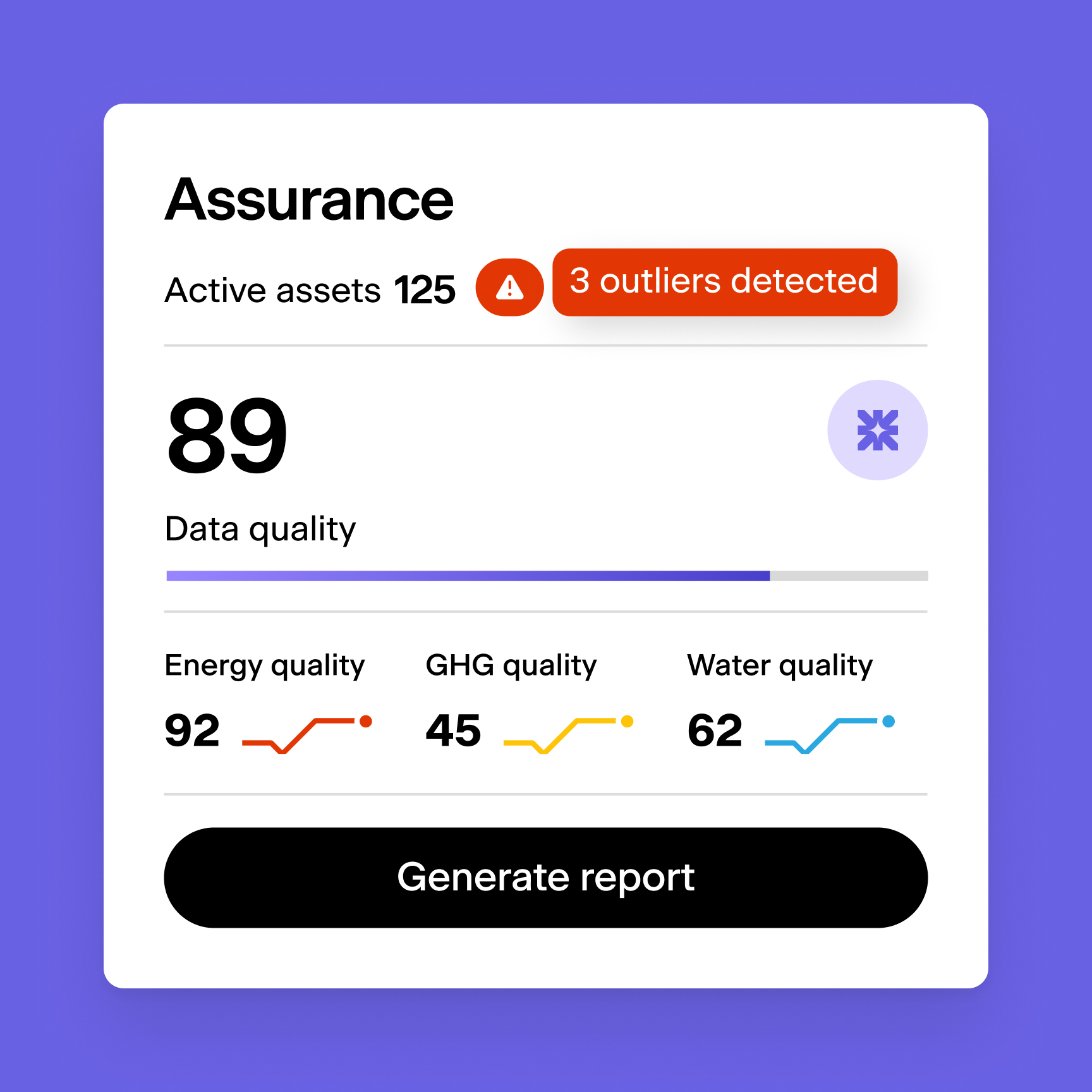
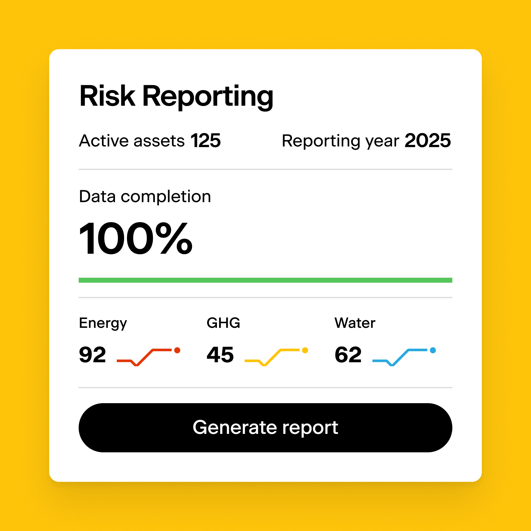
Every feature in Scaler, whether it’s bulk invoice uploads, API integrations, or AI-powered validation, was designed to remove friction. Our clients often tell us that the platform “just makes sense.” That’s not by accident. Every dashboard, report, and workflow is tested and refined with users across multiple roles, from sustainability analysts to property managers, so that the entire organisation can benefit, not just a single department.
We don’t see UX as surface-level design. It’s part of our data quality philosophy. When the experience is simple, data accuracy improves, coverage expands, and the insights generated carry more weight. The easier it is to use Scaler, the better the data that flows through it, and the greater the impact that data can make in driving decarbonisation and performance across portfolios .
From efficiency to impact
A well-designed data experience is not just about aesthetics. It’s about efficiency. Platforms with good UX allow users to complete tasks faster and more accurately, which is crucial for productivity tools managing large asset portfolios. In Scaler, users can automatically sync utility data, validate it with AI, and generate audit-ready reports in a fraction of the time.
The result? More time for strategy, less time on spreadsheets. When users across an organisation engage directly with data, sustainability stops being siloed. It becomes embedded in investment decisions, asset planning, and stakeholder conversations.
The future of user-led data
As we continue to evolve Scaler’s platform, our focus remains the same: make sustainability data accessible, intuitive, and actionable for everyone. Because the more people who can engage with sustainability data, the faster the industry can move from reporting to real impact.
User experience isn’t an add-on. It’s the foundation that turns data into decisions, and decisions into measurable change.